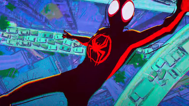
With its comic book-styled panels and dot-coloring, Spider-Man: Into the Spider-Verse already changed up the visual language of animated superhero movies. For the two-part sequel, Across the Spider-Verse, however, the imagery will push even further, as hinted at in the first teaser. In an interview with Collider, Chris Miller and Phil Lord discussed the way forward.
“The idea that we’d be going to different dimensions really opened up an opportunity artistically to have each world have its own art style, and to be able to push the folks at ImageWorks to develop a way to have each dimension feel like it was drawn by a different artist’s hand,” says Miller. “Seeing the development of that stuff is breathtaking, and really, it’s the reason we keep doing it, because it’s so hard to get it right.”
RELATED: Sony Drops a First Look At Spider-Man: Across the Spider-Verse (Part One)
Lord adds that their goal is always to “push animation in directions it hasn’t gone yet” on every project. With the likes of Spider-Verse, The LEGO Movie, and The Mitchells vs. The Machines amongst their credits as directors or producers, it’s safe to say they do.
The first Spider-Verse movie teased some different styles among the characters. Peni Parker looked manga-style, Spider-Ham like a classic cartoon, and Kingpin like a bizarre cut-out caricature. Entering the different universes they come from may imply that sort of style change on a massive scale.
Are you pumped for the next installments of the Spider-Verse? Let us know in comments below!
Recommended Reading: Amazing Spider-Man by Nick Spencer Vol. 1
We are a participant in the Amazon Services LLC Associates Program. This affiliate advertising program also provides a means to earn fees by linking to Amazon.com and affiliated sites.


